Basis of Project
To study professional movie posters from each genre (around 10 to 30 posters) and create a general sense of the techniques and similar ideas presented in that particular category. After studying the works I will then create at least 2 – 3 original movie posters from the category using the prominent techniques of the genre.
Some challenges of this movie poster project include:
- Using the right techniques in order to have a certain desired effect from the audience
- Creating a sense of emotion
- Using mainly my own photos
- Creating the posters to look similar to those of professional movie posters
The resources I need for this project include:
- Photosop
- InDesign
- Illustrator
- Printing Services
By the end of the project I should:
- Be able to efficiently navigate Photoshop, InDesign, and Illustrator
- Know how to create posters from several different images put together into one coherent piece
- Have a better sense of where and how to use text
- How to create fantasy posters
- Know how to do several poster creating techniques
- Have a better understanding and professionalism in poster design
Here are two examples of movie posters I created Spring 2011. The spiders movie poster was designed to be similar to that of a B Horror Movie. The second poster "The Forsaken" was designed to be an action-drama movie poster. These are similar to what I will be aiming for, but with more professionalism (meaning making sure that the details are taken care of).


http://vandelaydesign.com/blog/design/photoshop-tutorials-poster-design/
The above link is another example of what I will be looking at in order to learn these new movie poster techniques.
http://weburbanist.com/2011/02/15/27-fantastic-home-made-movie-posters/?ref=search
Another website with great poster examples.
Poster 1: HORROR
For this genre, I have chosen a movie poster to emulate, which is The Amityville Horror. This particular movie poster caught my eye mainly because of the eerie elements as well as the fact that the movie was based on a true story. Before choosing this poster to emulate, I researched other Horror movie posters and came up with very similar usages of color scheme, texture, and ect. Most Horror posters use the color scheme of blue (or green), red, and white--sometimes horror posters use yellow as a main color as well. Below are pictures of Horror Posters that are very similar in color scheme (Please click photo to zoom in):
.

.
.
This genre also has a similar grainy or shredded texture included in it's posters--this technique is to make the film feel realistic and scary..
Before I created my version to The Amityville Horror Poster, I researched photos that would be similar to the ones used in the original poster. Below are the original pictures along with the links of where I found them:


Now, I started creating the poster with the picture of the house, then adding several layers in Photoshop in order to create the poster's look and color scheme. Then, I edited the photo of the man and added him to the Photoshop document with the house. After I editing the image until it look fairly similar to the original, I then started to put in text. Below is the result of my attempt to emulate The Amityville Horror movie poster:

Below is an image of both my version and the original of The Amityville Horror poster.

Poster 2: COMEDY
For the genre comedy, I have chosen a movie poster to emulate, which is Horrible Bosses. This movie is about three friends (Jason Bateman, Charlie Day, and Jason Sudekis) who all despise their bosses (Kevin Spacey, Jennifer Aniston, and Colin Farrell) and want to get rid of them, for good--here is a link to the storyline, if you want to know more Click Here. Before I chose this poster to emulate, I researched other Comedy movie posters and came up with very similar usages of color scheme, texture, and ect. Most Comedy posters use a white background (if the movie is a true comedy). An exception to this is when comedy posters use scenery as their backgrounds, which is usually used when the movie is a hybrid including romantic-comedy, sport-comedy, etc. Below are pictures of Comedy posters and Comedy poster hybrids that are very similar in poster scheme(s) (Please click photo to zoom in):
.
.

..
Before I created my version of the Horrible Bosses Poster, I researched photos of the actors that performed in this film--most of the photos are not from the film, but are random images of the actors. Below are the original pictures along with the links of where I found them:


Poster 3: ROMANCE
For the genre Romance, I have chosen a movie poster to emulate, which is 27 Dresses, which is a romantic-comedy. This movie is about a woman named Jane (Katherine Hiegl) who has been a bridesmaid 27 times. In the movie, Jane struggles with the fact that her sister is going to marry the one man she has been secretly in love with for a long time. To read more about the plot, click here to follow the link. Before I chose this poster to emulate, I researched other Romance movie posters and came up with very similar usages of color scheme, texture, and ect. Most Romance posters use images of couples with their faces close, but their gaze never meets( if the movie is a true romance). But most romance movies (I have found) are usually hybrids and are never true romance movies. Most romance movies usually fall into the hybrid genre romantic-comedy. The layout that romantic-comedy movie posters use are similar to the comedy layout except that there are images of the main couple. Below are pictures of true Romance posters and Romanctic-Comedy posters that are very similar in poster scheme(s) (Please click photo to zoom in):


As for 27 Dresses, this poster is a several techniques in order to promote the film to the public. These techniques include: using images to set the scene as well as to tell who the main characters are as well as using a white background (normal for comedy posters) and a handwritten dress (which promotes the playfulness of the movie). In this poster, there is one main individual depicted (Katherine Hiegl) in a dress made out of words—the words make the dress... literally!
Before I created my version of the 27 Dresses Poster, I researched photos of people in wedding gowns or just regular dresses. Below is the original picture, click here to follow the link to the image:


Now, I started creating the poster by editing the individual photo of the woman in the wedding gown, which took a lot of effort since some of the images were heavily pixelated. First, I smoothed the features of the model, then selected the outline of the dress (which was a tedious process since I wanted to be precise) and made the dress green, which would help me see the curves of the model while I wrote in the text. Since the designer of the poster did not use a font, I too used my own handwriting to create the text on the poster! Below is the result of my attempt to emulate the 27 Dresses movie poster:


Here is the comparison of My Version and the Original:

Poster 4: ACTION/THRILLER
For the genre Action/Thriller, I have chosen a movie poster to emulate, which is The Mechanic. This movie is about an assassin named Arthur Bishop (Jason Statham) who has a unique talent for eliminating targets efficiently. To read about the plot, click here to follow the link. Before I chose this poster to emulate, I researched other Action/Thriller movie posters and came up with very similar usages of color scheme, texture, and ect--BUT there was an eclectic amount of different ways to promote an action/thriller movie poster. Most Action/Thriller posters use images of the main characters in some sort of pressing situation--the expressions on their faces are usually serious. The layout that action/thriller movie posters use slightly tilted text and photos, which is used to create a sense of motion. Sometimes action/thriller posters divert from the genre's particular similarities. Below are pictures of action/thriller posters that are very similar in poster scheme(s) (Please click photo to zoom in):

Now, I started creating the poster by editing the individual photos of the different weapons, which took quite a bit of time since I had to erase the backgrounds of the photos, then select the weapon and fill it in with orange. After turning the weapons orange, I added them to the main document for the poster. Before this step though I had to create a silhouetted gun that would be a guide for all of the tiny little guns. As for the typography, I found a similar font at dafont.com for the title, slogan, etc. Below is the result of my attempt to emulate The Mechanic movie poster:

Here is the comparison of My Version and the Original:

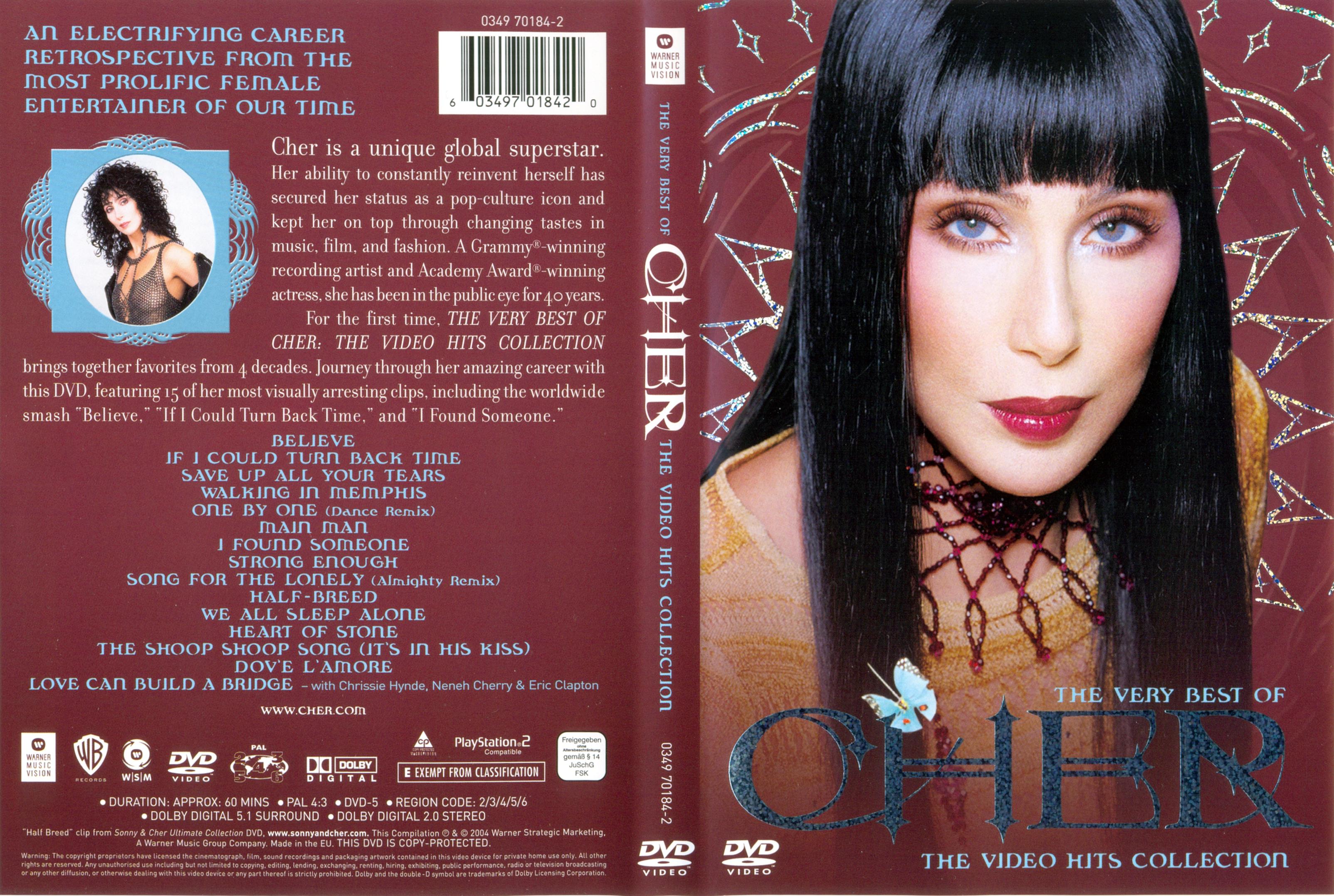
For the genre Musicals, I have chosen a movie poster to emulate, which is Burlesque. This movie is about a small town girl named Ali (Christina Aguilera) who travels to LA to a neo-burlesque bar run by a former dancer named Tess (Cher). To read about the plot, click here to follow the link. Before I chose this poster to emulate, I researched other Musical movie posters and came up with very similar usages of color scheme, texture, and etc. If the musical is more dramatic and has a dark mood such as Phantom of the Opera, etc. the poster will use darker shading and dramatic lighting. If the musical is more light and carefree (like a comedic-musical) the lighting of the images used will be brighter and the colors used on the poster will be vibrant. Below are pictures of Musical posters that are very similar in poster scheme(s) (Please click photo to zoom in):

Before I created my version of the Burlesque Poster, I researched photos of Christina Aguilera and Cher as well as a image of a bowler hat. The photos and their links are below.


Now, I started creating the poster by editing the individual photos of Cher and Christina Aguilera, which took quite a bit of time since I had to erase the backgrounds of the photos. Also, for the Cher photo, I had to get rid of the distracting necklace she wore in the original photo and for Christina I had to add the bowlers hat. For both of the photos, I had to do heavy editing as well as do the colorsplash on the lips. After editing the photos of Cher and Christina, I added them to the main document for the poster. As for the typography, I found a similar font at dafont.com for the title, slogan, etc. To create the special effects on the Burlesque title, I had to go through several steps in order to achieve the final look. Below is the result of my attempt to emulate the Burlesque movie poster:

Here is the comparison of My Version and the Original:

Poster 6-9: Original Poster Concept Design


No comments:
Post a Comment